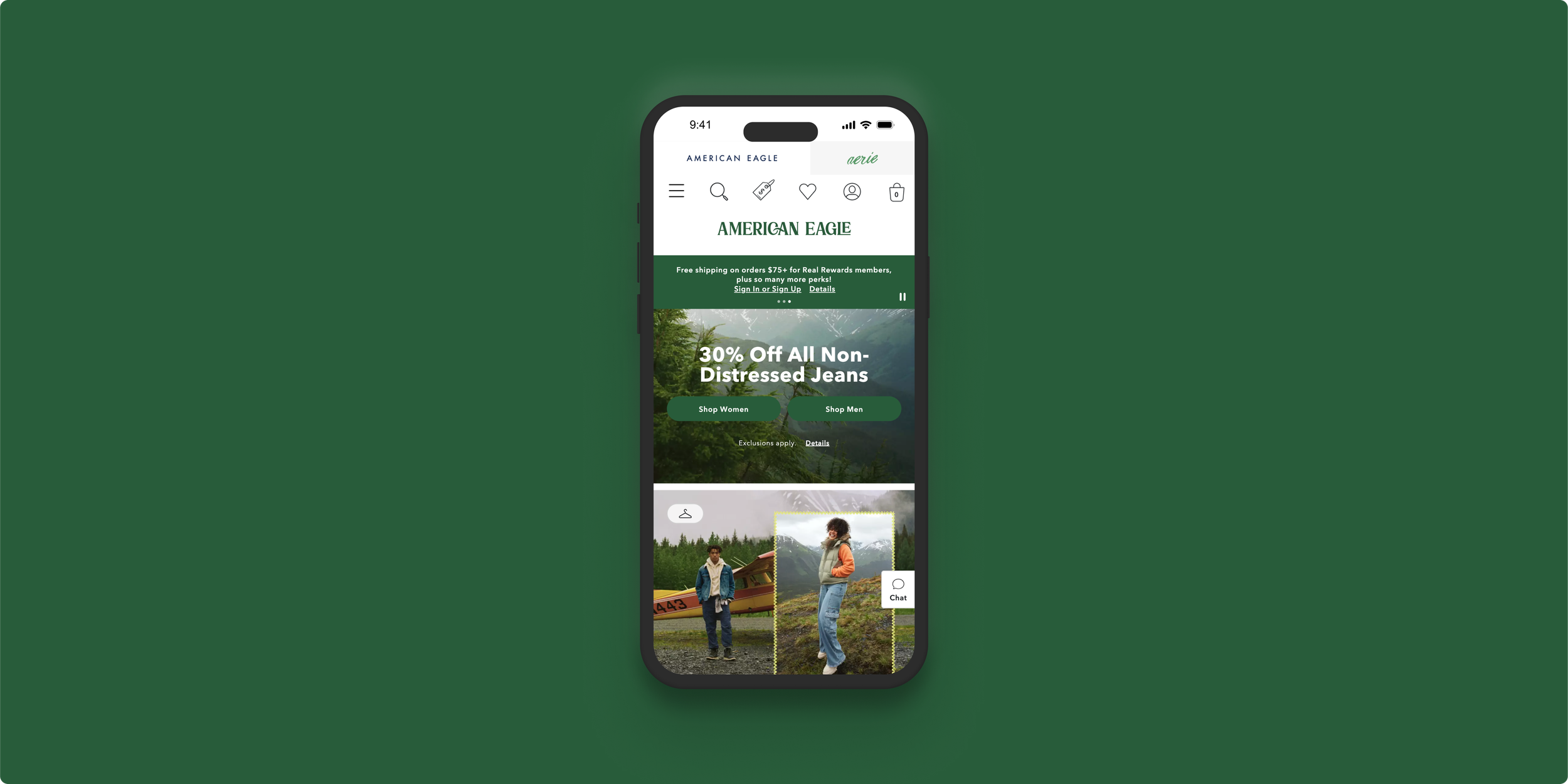


One of my main clients at ESW was American Eagle, a billion-dollar clothing company with clothing outlets worldwide. I had to deal with demanding clients and improve the website’s overall experience.
While working at ESW, I was the sole designer for American Eagle’s storefront and checkout. I worked on improvements that included ratings/reviews, free shipping progress indicators, promotions, size recommendations and improving the filtering and sorting on the product listing page. A standout feature that delivered very positive results was the redesigned newsletter modal.
American Eagle wanted to redesign their newsletter pop-up on international sites, due to a lack of user sign-ups. They wanted to ramp up the number of times the modal would display to the user - a dark pattern that could cause more harm than good for users. Dark patterns are design elements that deliberately obscure, mislead, coerce and/or deceive website visitors into making unintended choices. This might damage the brand.
Firstly, research was done on the best practices for website models. This was followed by competitor analysis on e-commerce sites that used a modal approach to target users about their newsletter. A modal is a pop-out element that displays on top of other content on the page. Finally, a Maze user test was conducted on users from Japan and Australia to understand their views on modals better.
A newsletter pop-up modal is a very popular method for e-commerce websites. Some well-known brands that use it are Adidas, GAP, Everlane, and Quicksilver. Research has shown that modals may seem intrusive, especially if used incorrectly, but research shows that they improve conversion. They work by offering something of value (a discount) and utilising specific triggers (like a user's exit intent) to display a pop-up experience that is not annoying and generates leads.
Timing is an important factor to consider before displaying a pop-up. There is nothing more frustrating than landing on a website for the first time and being immediately met by an email opt-in pop-up. Users haven't engaged with the website yet- why would they be willing to give up their email addresses? A better approach is to be more patient and wait for the right time to display it. One study found that waiting to display a pop-up until a visitor had viewed two pages produced more than double the conversion rate compared to the initial landing page.
Research also shows that engagement peaks right after a person scrolled below the fold, which is roughly 1000 pixels from the top of the page. Using Hotjar, it can be determined where the average fold is on the page. This is the perfect place to initiate the newsletter modal.
32 users were tested from panels in Japan and Australia. 53% said they would occasionally sign up for newsletters on e-commerce websites compared to 38% that would never. The user's biggest motivation for signing up for a newsletter was a discount (63%), while not far behind were exclusive deals (47%). Very few users sign up for newsletters based on interesting content (28%) and the discovery of new products (22%). 94% of users are more likely to sign up for a newsletter if there's a discount included.
Users were asked when a newsletter pop-up should appear on a website. The highest response was before the checkout (38%). Users agreed that this is the most likely place to sign up because they are just about to make a purchase and will want to receive a discount before purchasing. Many users agree that newsletter pop-ups can be annoying, but with a discount included, they can be very beneficial.
From user testing, toast notifications (non-modal, unobtrusive elements to display a short message) at the bottom or top of the page proved more impactful. This is less intrusive on the user and doesn't disrupt their flow, especially on the shopping bag. It will display after several seconds, catching the user's eye but not disputing their view.
The redesign proved to be a success. The opt-in rate for Japanese for new non-email users ranged between 1.1-1.5%. This has increased to 5% since the introduction of the new design.