Music U
For a university assignment, I designed and developed an app that teaches kids how to read music.

Now kids can learn music in a fun and interactive way
Music U is a music learning and composition app targeted for children ages 6-12. The main idea behind the app was to mix work and play and make something that is both fun and educational for children wanting to learn the basics of music. It can show children learning a musical instrument isn't hard or scary, it can be fun and easy with a mobile app!
Click on the video below.

User Research
Interviews were conducted to gather information from our target market. We organised interviews with three children of the ages 9 - 12. Firstly, we found that the app must be colourful, with a ‘fun feeling’ design aspect as not to bore the younger user. It can incorporate cartoons and characters but must also display ear training/ music theory references as not to sway from the original purpose of the app. A creative environment was a key aspect of the app, as well as a fun and friendly musical environment.

The wearable
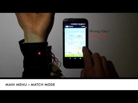
The app can be connected to a wristband via Bluetooth. Attached to the wristband is a vibrator and 6 neopixel lights. The wristband tells whether you are right or wrong and indicates how close you are to the correct answer using lights and vibrations. With the aid of the accelerometer in the phone, you can move the phone to change the notes or chords. The children became more interested when there was interaction involved.


The process
When designing the function and look of the app we had to consider the specific needs children have and how they differ from an adult user. Understanding children's cognitive and motoric development played an important role in designing the app as well as trying to make the app specifically visually appealing to children.
Based on prior research and user testing we discovered that children respond best to a simple, colourful, clear and straightforward design in apps. We wanted the app to have the ability to share their accomplishments with peers and family, through social media.

The app has two functions, “Match” and “Create”.
Match is the learning aspect of the app. It helps children train their ear so that they can match suitable keys, notes and chords to a given song. It works by firstly choosing a song from their phone to download onto the app or choosing a song from the apps music library. The song will play and the user will be given a list of different keys to choose from. The user tests out the given keys to find the key that matches their chosen song.
Create is the section of the app where the user can pick up their phone and create a song from scratch. They choose a key and octave and then begin to create a song with chords, notes and drums. They can also record their voice or any external sound to add to their song too. The same effects that are in the match section is also available in create to make the song more interesting.

Built in Android Studio, designed in Adobe Xd
A lot of new skills were developed over the course of this project. Music U was the first mobile app I built in Android Studio. It was my first experience with user interface design, usability studies and integrating human factors in software development. It was the beginning of my love for interaction design.