


During my three month internship as a UX Designer at Guidewire, I had the exciting responsibility of redesigning their application VendorEngage. I got experience working in an agile environment, working on a project from start to shipment.
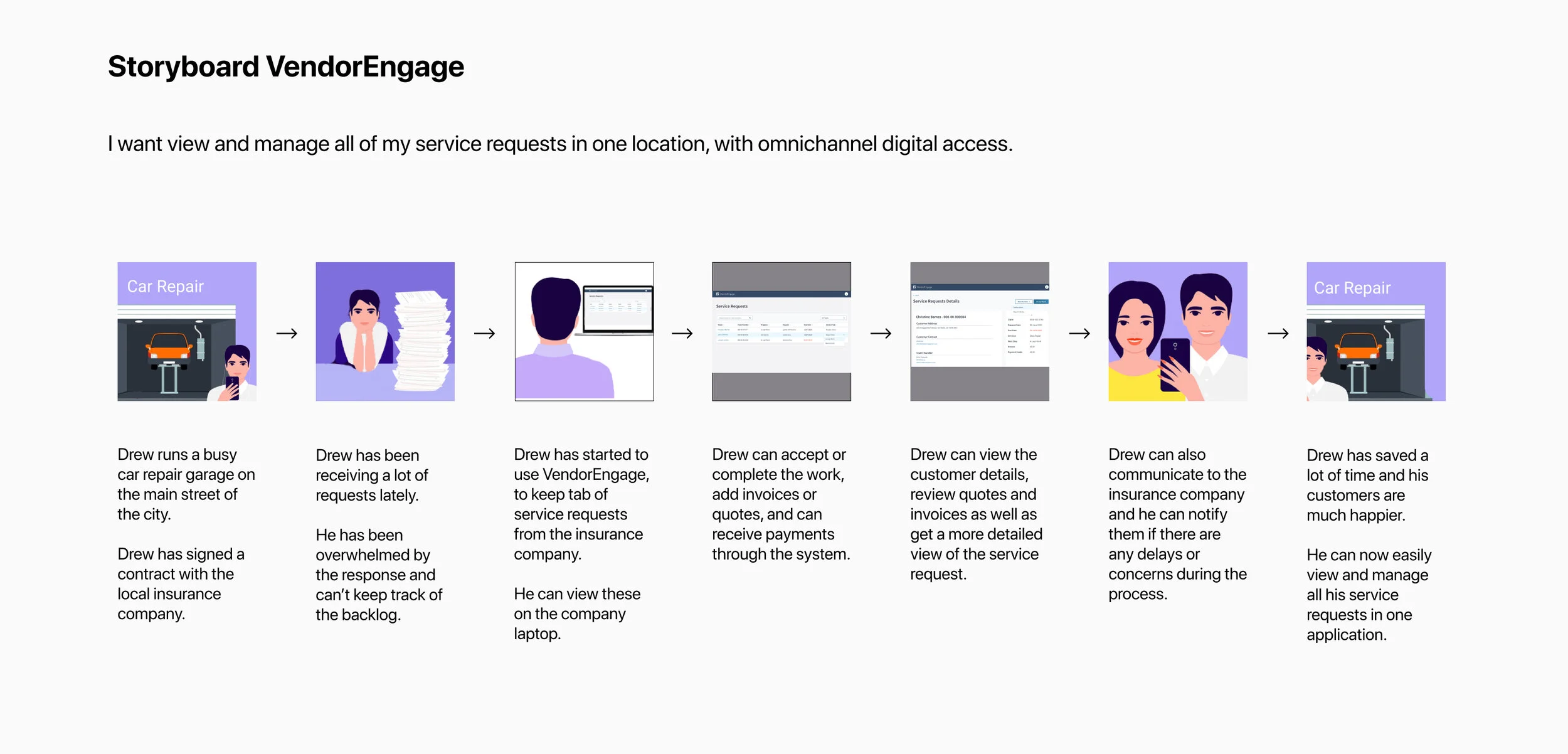
VendorEngage is a platform to allow Vendors manage service requests and to communicate with service providers. It allows car repair garages, law firms or medical services accept or reject requests or pause the service if there is a problem. They can also receive their payments on the application and upload invoices or quotes.
At the beginning, it took a lot of detective work and playing around to fully understand the application’s capabilities and flaws.
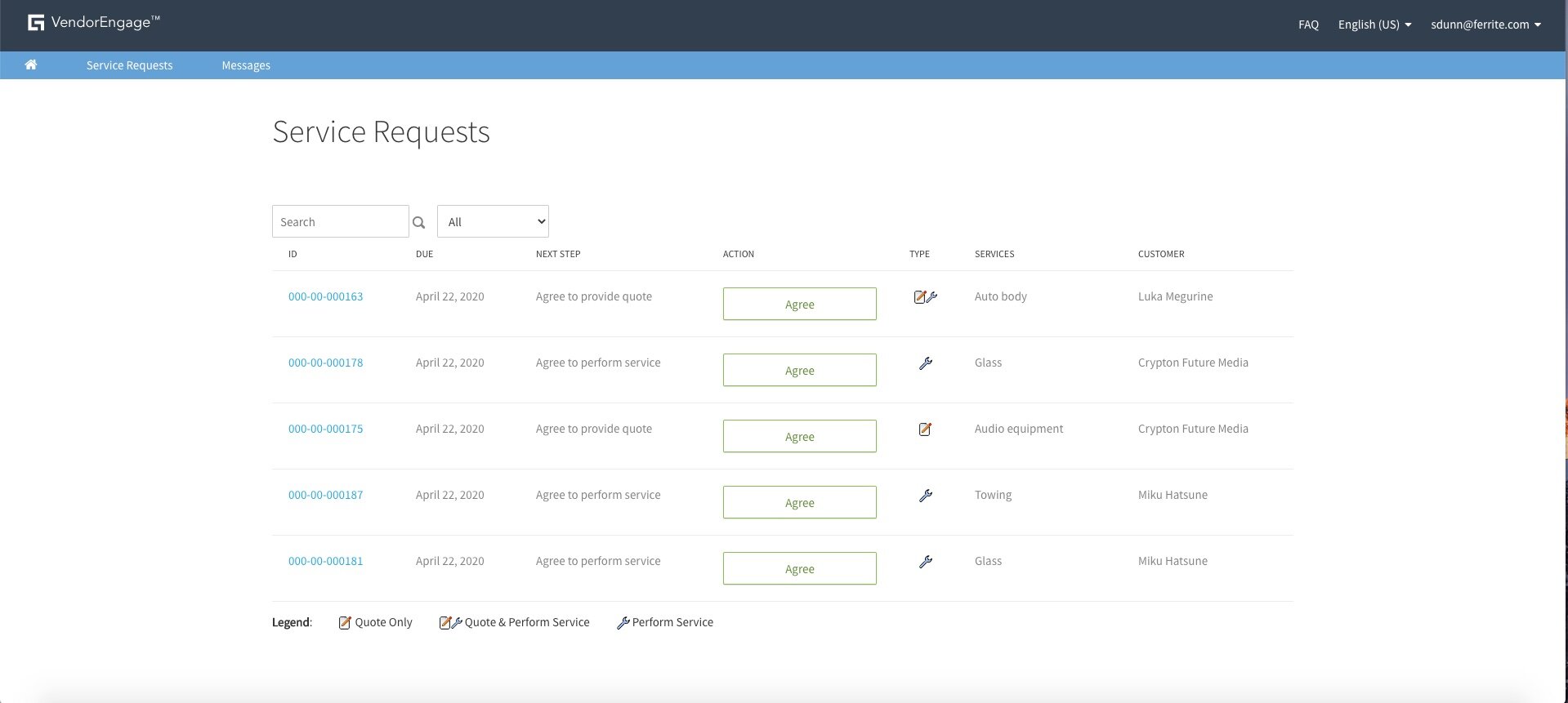
The application felt limited, cluttered and over complicated for such a simple application. The legend at the bottom of the home page took me ages to understand. Some buttons lead to the same page while some buttons meant the same thing. The UX writing was seriously flawed.
The table was not organised. Completed, rejected or ongoing tasks were all crammed into the same menu, making it very confusing for the user.
The service request details page was all over the place. Some of the headings didn't make sense to me. These problems needed to be resolved with a completely new design.
Guidewire is strict on their guidelines. Everything must be in multiples of 8pt. Floorplans are used by designers and developers which make the user interaction responsive and intuitive. They are a templated UI that have a consistent grid. My designs contained the i-shape floorplan (Header only).
For the VendorEngage 11.3 release version, I had to focus mainly on the UI aspects as we had a short amount of time to reach the 11.3 deadlines. I got experience using a design system and understanding how important it is.
I separated the service and request requests into two separate data tables and I made the whole row clickable for the user. The service requests details page was organised better and rather than having a separate page for every action, I created modals to save the user time on clicks and page loading times.
https://guidewire.invisionapp.com/
After the 11.3 version design had been complete, I sent it off to the developers. This was my first time attending grooming sessions and stand ups. By using the inspector tool, I made sure that my designs were correctly implemented.
For the next version I wanted to hear about the current user’s feedback and understand how we can solve them. With my new designs, I wanted to solve the user’s problems.
With the user in mind, I created a persona and user stories to fully understand their needs. I attended meetings with customer representatives and I received very helpful feedback:
• Users wanted a more advanced invoice and quote feature to add more lines.
• Current users are having to constantly refresh the page to see new incoming requests.
• Users want the menu to be better organised.
• Users would like a better understanding of how many new requests they have.
I created a home page which contained a dashboard displaying new quote and service requests, as well as new messages.
When there are no new requests or messages, empty states pop up to inform the user that there are no new requests.
I separated the service and quote requests onto separate pages, and I sorted the tables by active, complete and cancelled, so the requests are organised better.
The table can also be sorted by recently created or recently viewed as Customers have stated that they would prefer if they could pick up where they left off from the previous session.
A notification panel was added so the users don’t have to constantly refresh the page. I organised the notifications into new, which is today, and Earlier, which is from yesterday onwards. The blue dot and the blue highlighted text indicate that it’s an unread notification.
I completely redesigned the messages page so the user can clearly see what request is being mentioned. The left side is scrollable and if the user clicks on a subject, they can see the full history of the messages.
See for yourself in Invision:
https://donalkearns479849.invisionapp.com/console/share/PW1GUXBQKT/480260337
I had an amazing time at Guidewire. It was a great experience to work on a project from start to finish and to see my designs come into fruition. I learned so much during my time there and it has given confidence to pursue my love for design in the future.