Who said a financial design has to be a pain, rather than something simple, beautiful and, most importantly, pleasant to use?
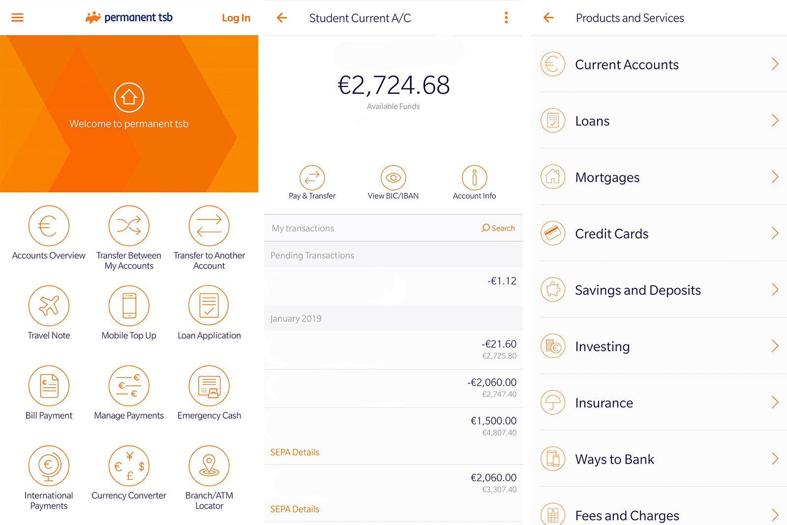
Being a Permanent TSB customer, I identified numerous flaws with their banking app. Not only was the app slow and many of the apps features did not serve a viable purpose, it’s design was also complex, disabling many of its users.
How can we design a banking app that has maintained its full-scale banking functionality as well as be efficient and easy to use for every user? Firstly, I conducted surveys on the users in order to identify what were the important aspects of a mobile banking app.
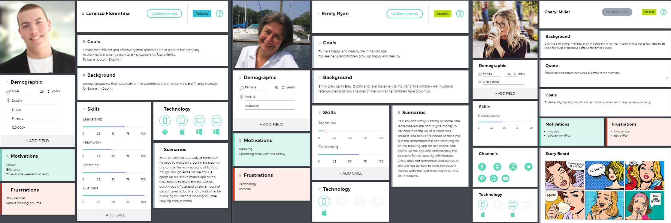
After conducting many interviews, gathering publicly available information and organising individual questionnaires on social networks, I formed several potential user profiles for the digital banking service. I wanted to target every age group, especially the older generation who would usually struggle with these kind of products.
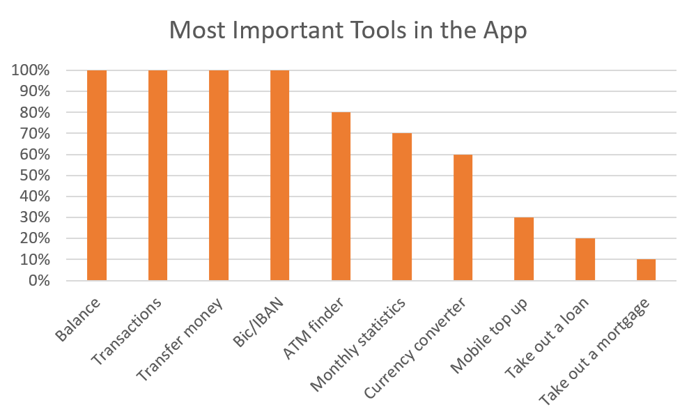
Each person was asked to pick out the most important things a banking app needed. Everyone agreed that the balance, being able to transfer money, and transaction history are all essential. Fewer people believed taking out a loan or a mortgage was necessary on the app as most people would visit a branch to do this as it is a bigger deal. Instead of clogging up the app with lots of features that users will not use, keep the most important stuff to create a better user experience.
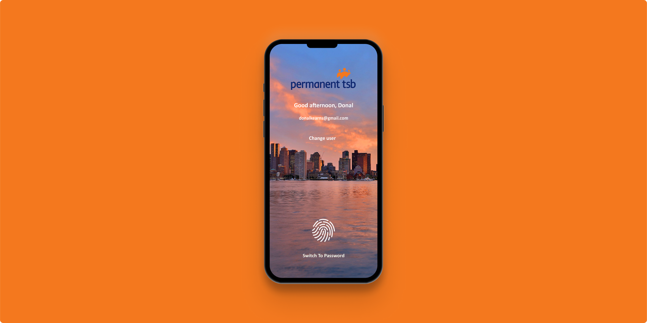
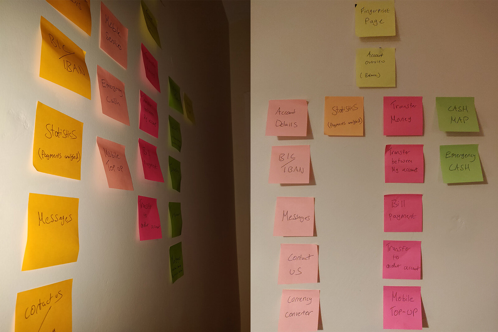
There was is so many options on the home screen. Users found it to be overwhelming and took longer than it should have to find what they were looking for. Organising the interface properly can have a big effect and can make the customer’s lives a little easier.
NEEDS
• Account Balance
• Transactions
• Transfer Money
• Emergency Cash
• BIC/IBAN
WANTS
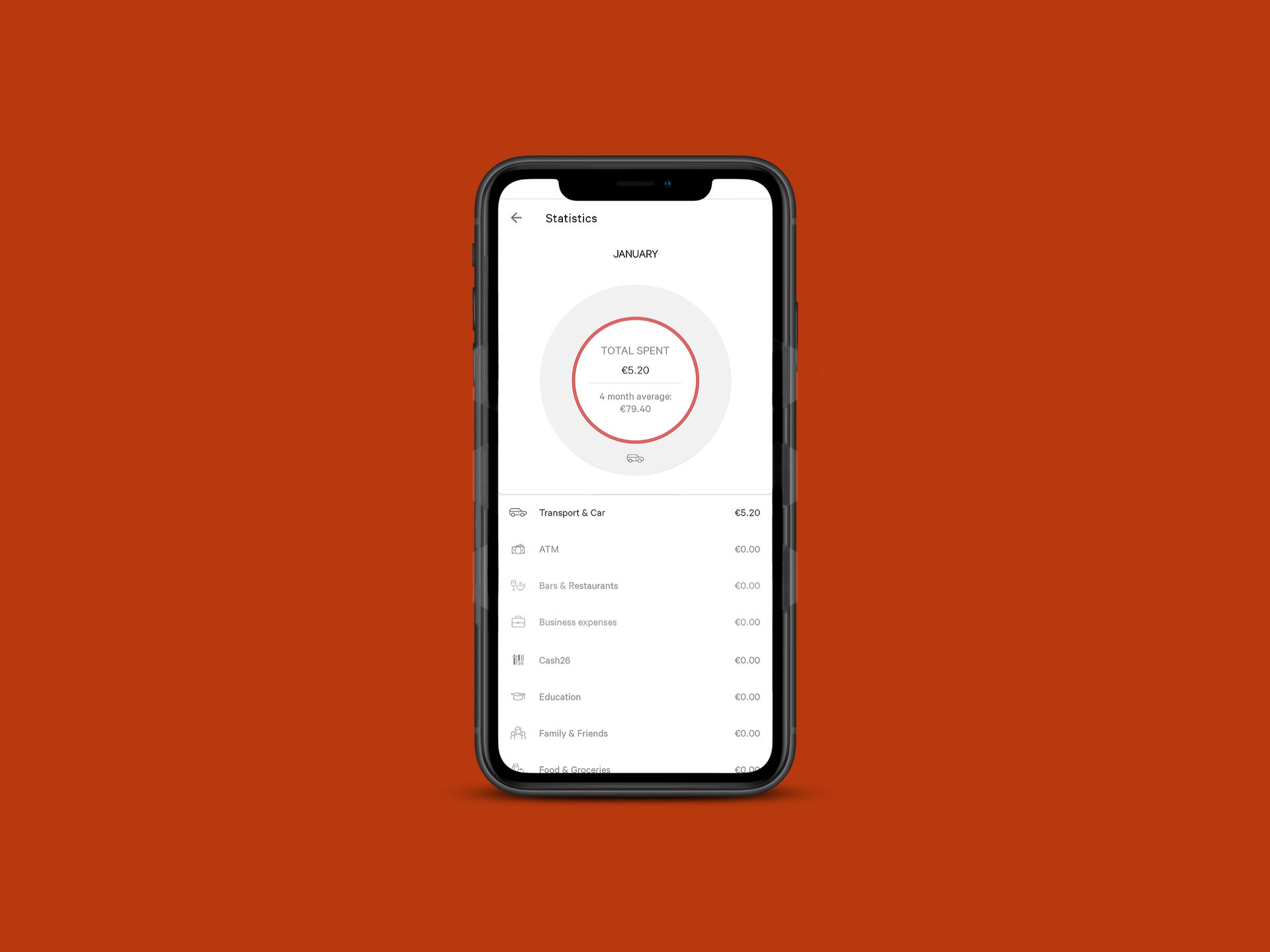
• Statistics
• Currency Converter
• Loans
• Cash Map
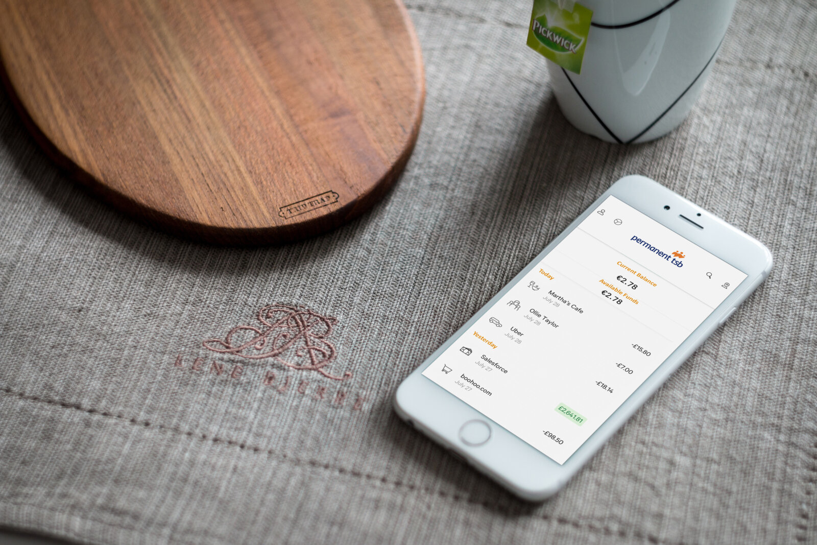
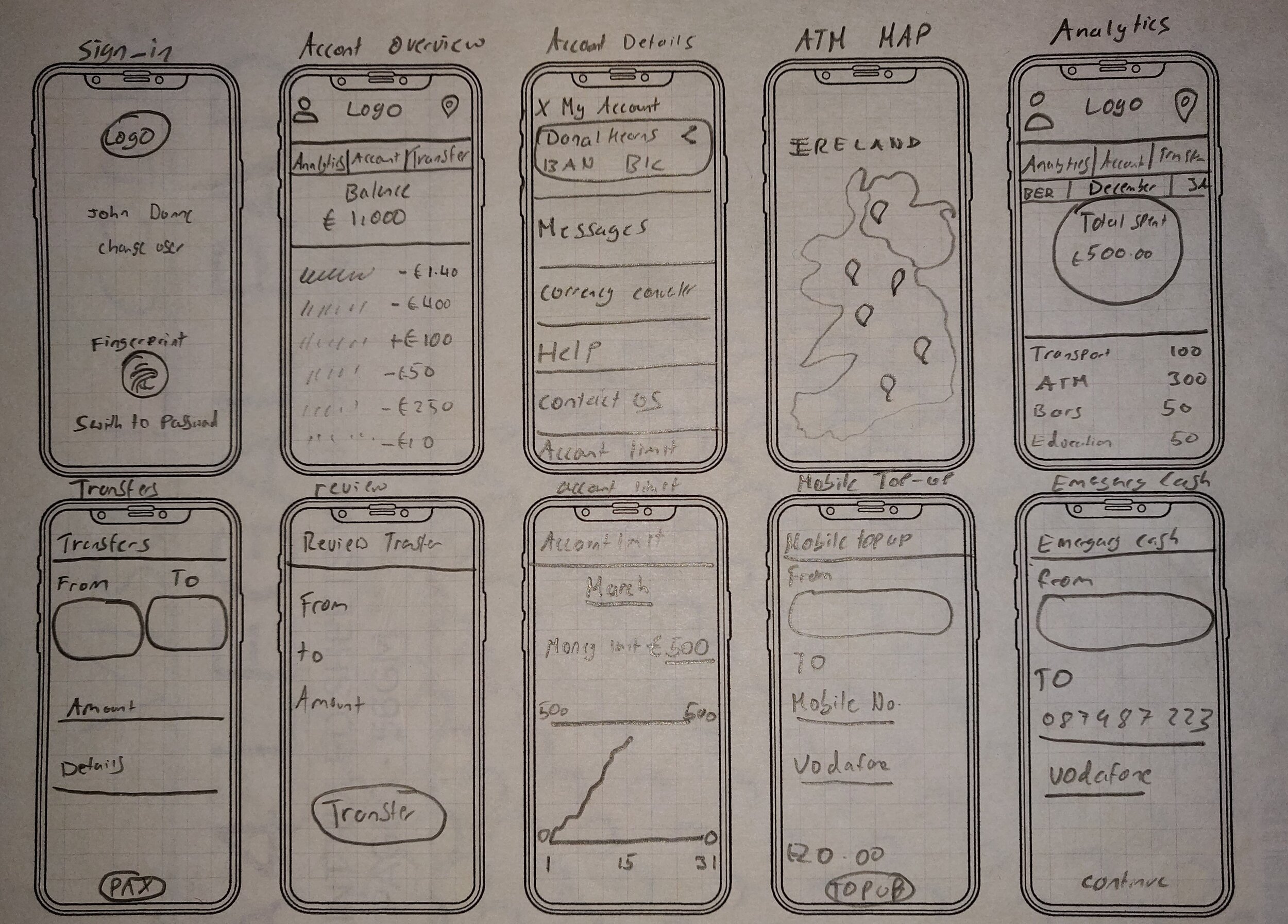
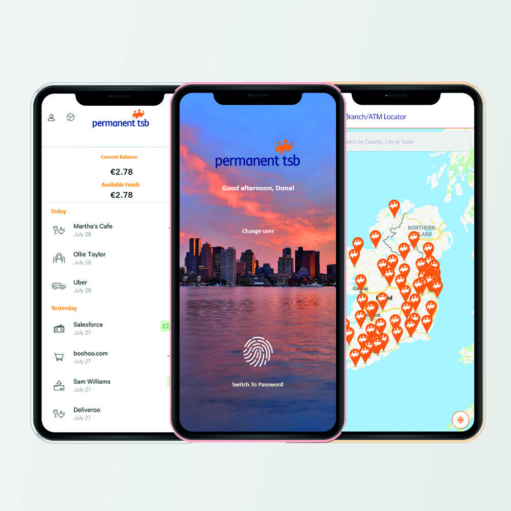
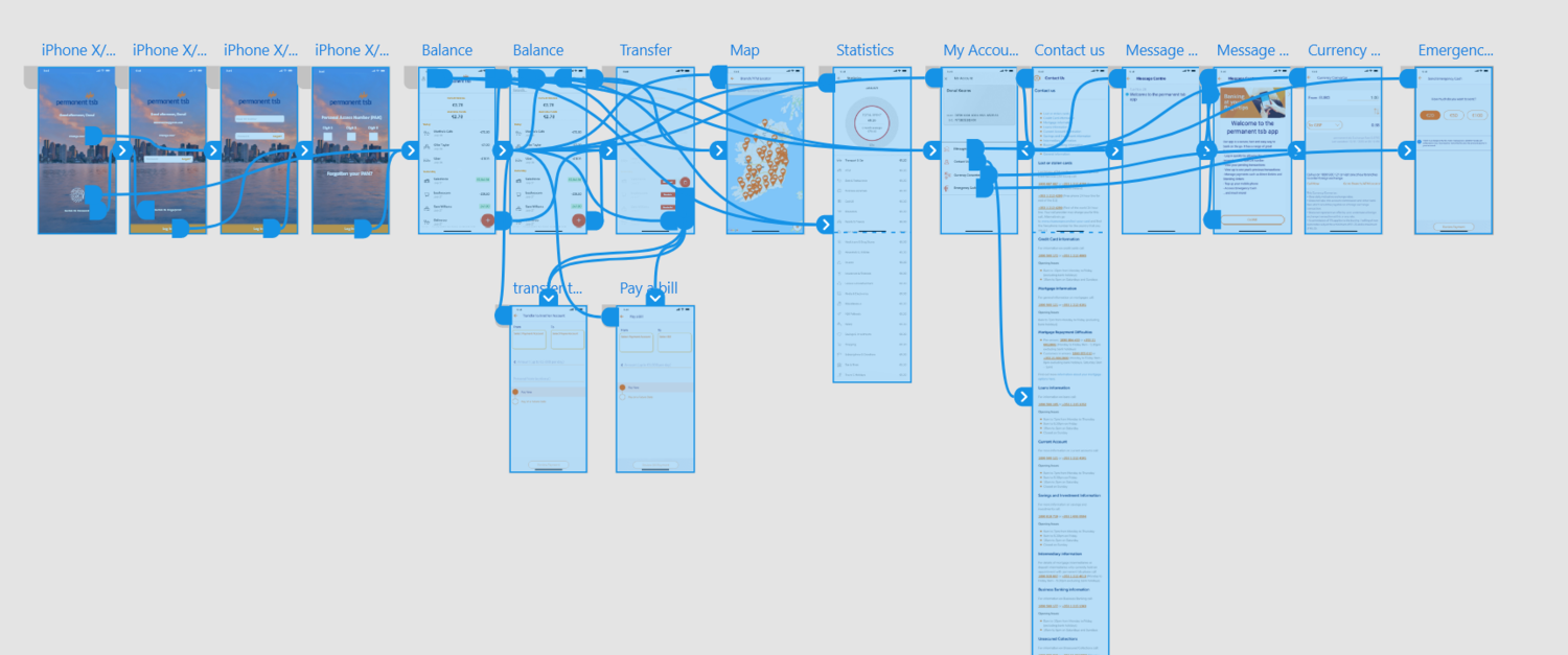
I organised the app into four sections: Account, Statistics, Transfer and Cash Map. These were the most important sections the users wanted from the results. Inspired by modern banking apps like Revolut and N26, the four categories were displayed on the index page (overview). Then the extra tools were added inside these categories. The finished result was a clean and concise overview page.
This is a new addition you see nowadays in modern banking apps. If traditional banks want to keep up, they must adapt to people’s needs in the modern era. This tool was a must for users, according to the results, as people now expect every bank to have it at this stage.
The final look turned out to be a more clean and concise app, with new added features, while less important features were taken out, to give the best experience for the user.