


Dublin transport congestion is among the worst in Europe. On average, 107,000 people travel into Dublin city centre on public transport every day. That’s only 18% of the Dublin population, one of the lowest in Europe. Could redesigning the National Transport app increase the public transit percentage?
Transport for Ireland (TFI) was developed by the National Transport Authority to promote and coordinate the provision of public transport in Ireland. However, their mobile apps are outdated, clunky and most of the time are broken.
The feedback is already there. The Google Play and Apple App store have tons of reviews describing their experiences while using the app. These problems need to be considered.
There are currently five TFI apps on the app store. All off them have received extremely poor reviews. Rather than cluttering the user’s mobile, I suggest to combine the apps into one - the TFI app.
Users were asked to test each of TFI’s 5 mobile apps and to find out what exactly each app can do. The users were given post it notes to display the purpose on a wall. It was obvious to see that the apps had similarities. This really confuses users.
Rather than having five teams working on five apps, focus on one to reduce similarities, confusion and work!
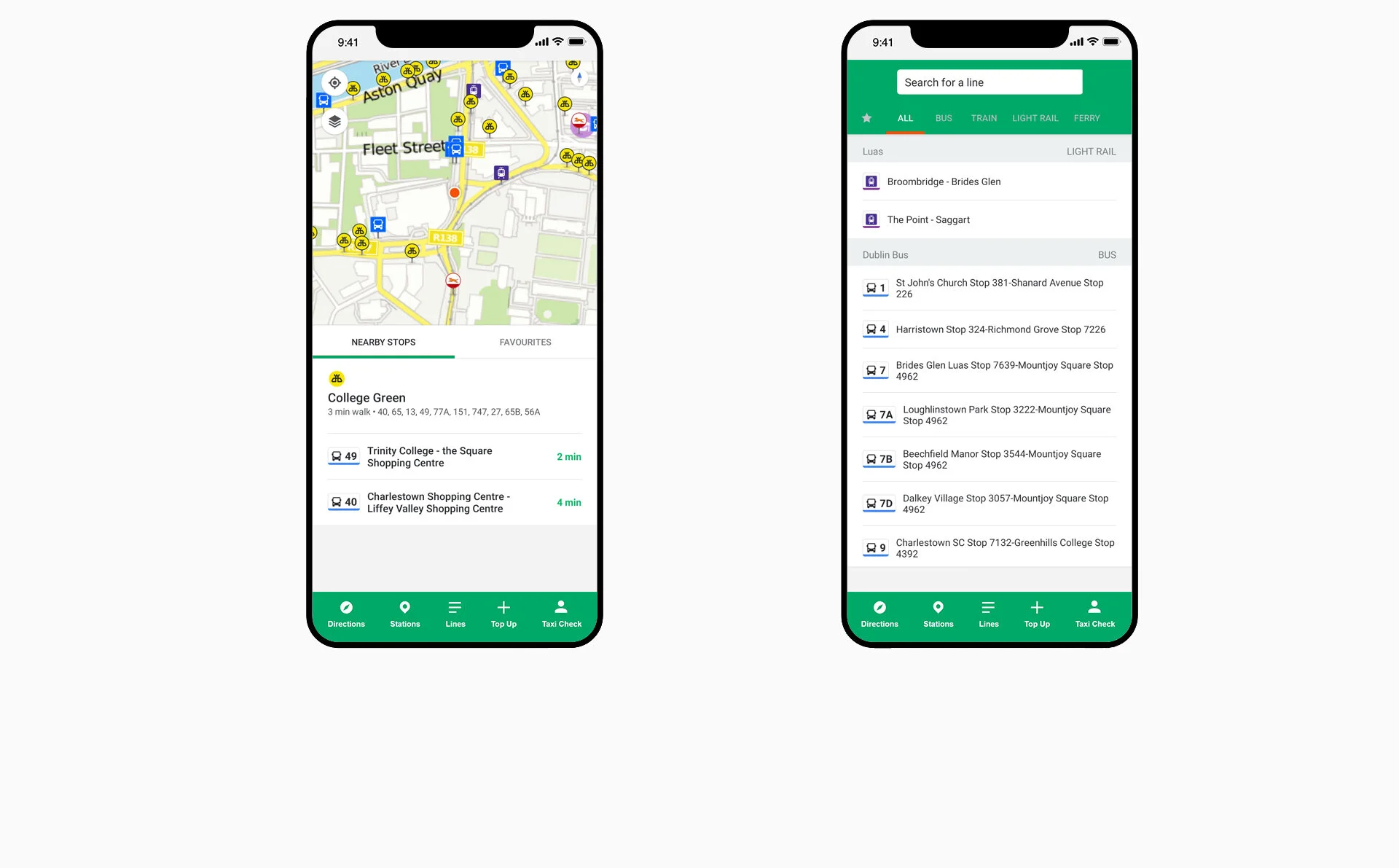
You see a lot of apps these days with menu buttons at the bottom, the top left and sometimes even the top right! This can be overwhelming for some users. Google Maps have recently dropped their hamburger menu at the top right of the app, and have gone for a five bar menu at the bottom. I have designed the app the same way without anything distracting the user at the top end of the screen.
A user study was conducted, focusing on investigating whether participants are likely to prefer a list-based interface, or a map-based interface. It turned out that the list based interface was more favourable, but that does not mean you disregard a map-based interface as that is still cutting out a lot of users preference.
Generally, the map interface has more information visible, while the list interface abstracts away more information, providing a simpler interface. The both have their advantages so I designed both.